3.4. Advanced Design
Advanced Design
Advanced Design allows you to create a rich, structured Card experience, similar to a mini-website.
It is built around two main elements:
Cover (top section of your Card)
Sections (content blocks below the Cover)
Advanced Design is available via the mobile app.
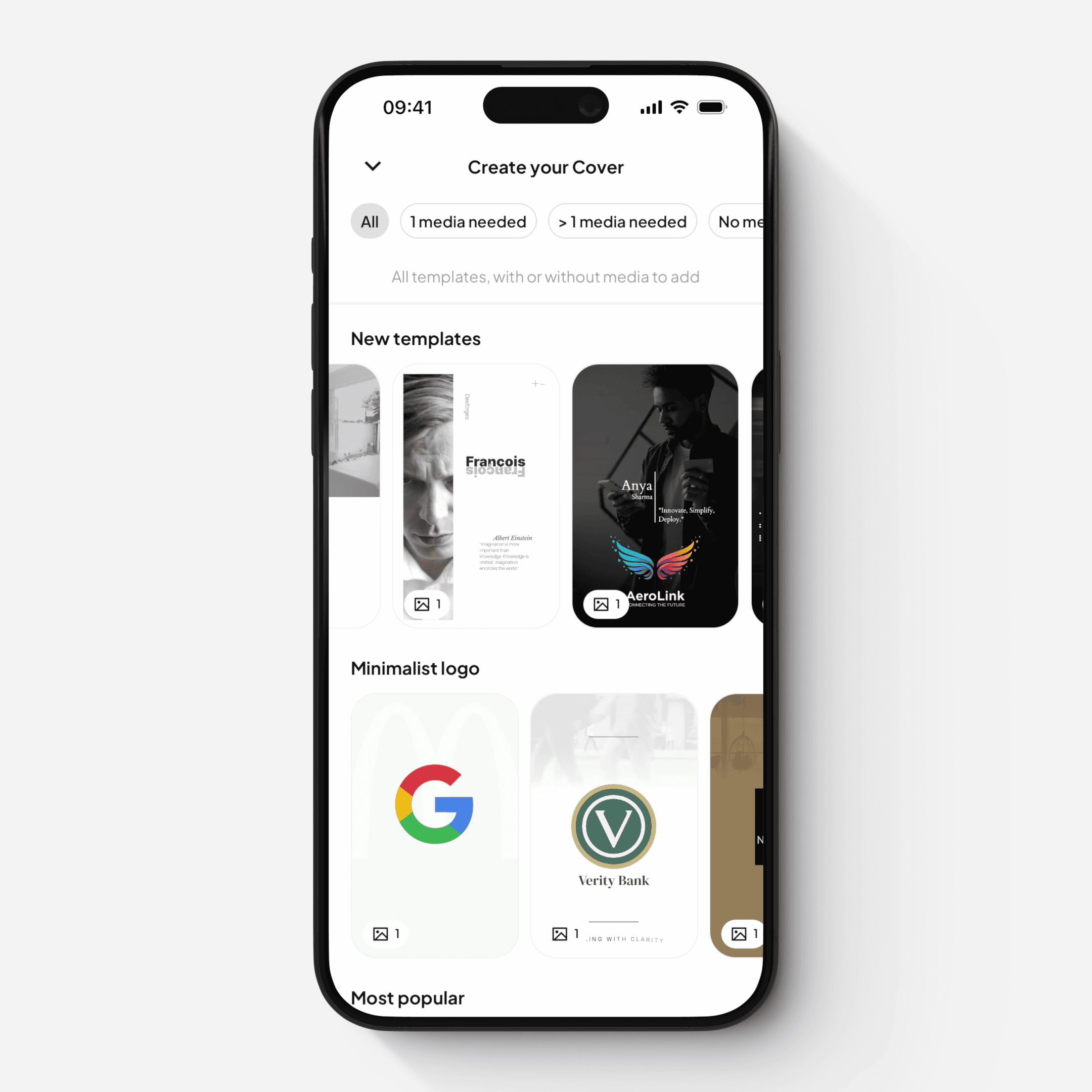
Cover
The Cover is a dynamic section displayed at the top of your Card.
You can:
Choose from a variety of ready-made templates, or
Create a fully custom Cover from scratch
The Cover supports multiple layered elements, including:
Images and videos (with effects and transitions)
Text layers (with animations and styling)
Logo overlays
Clickable links
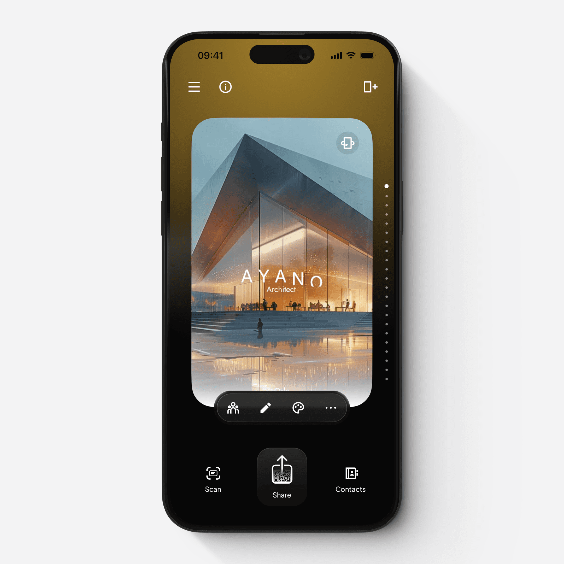
When a Cover is set, it is also used as the preview thumbnail when your Card is shared.
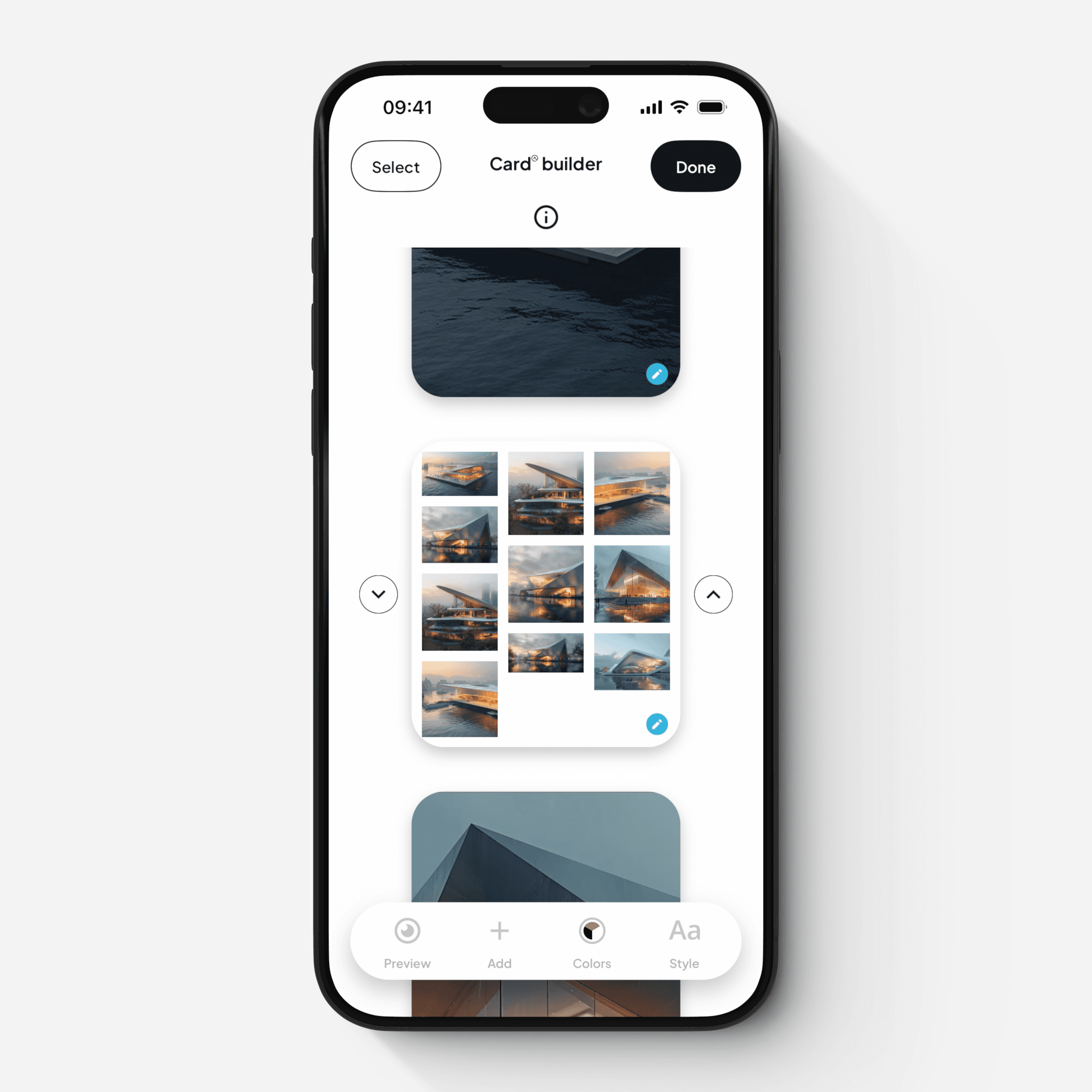
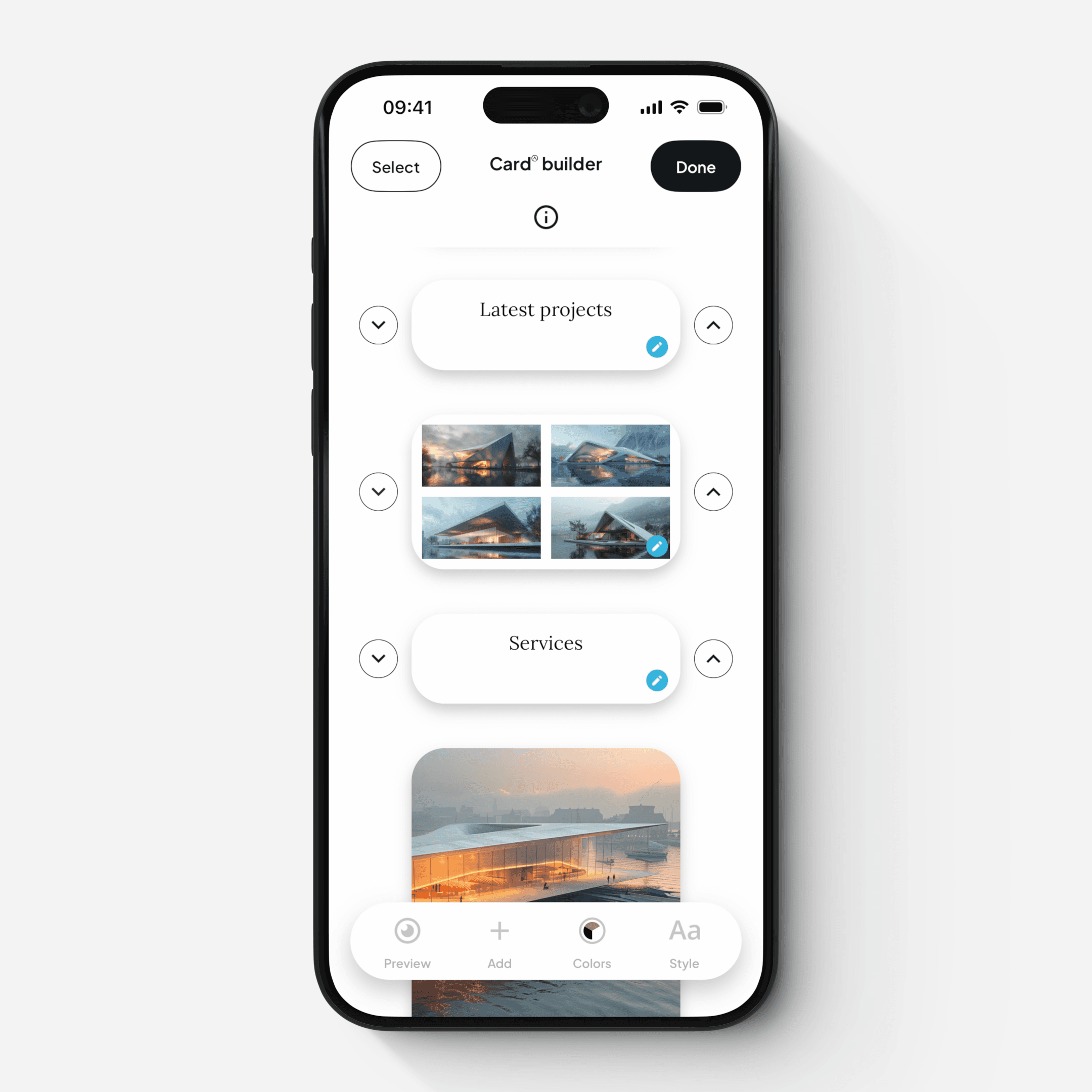
Sections
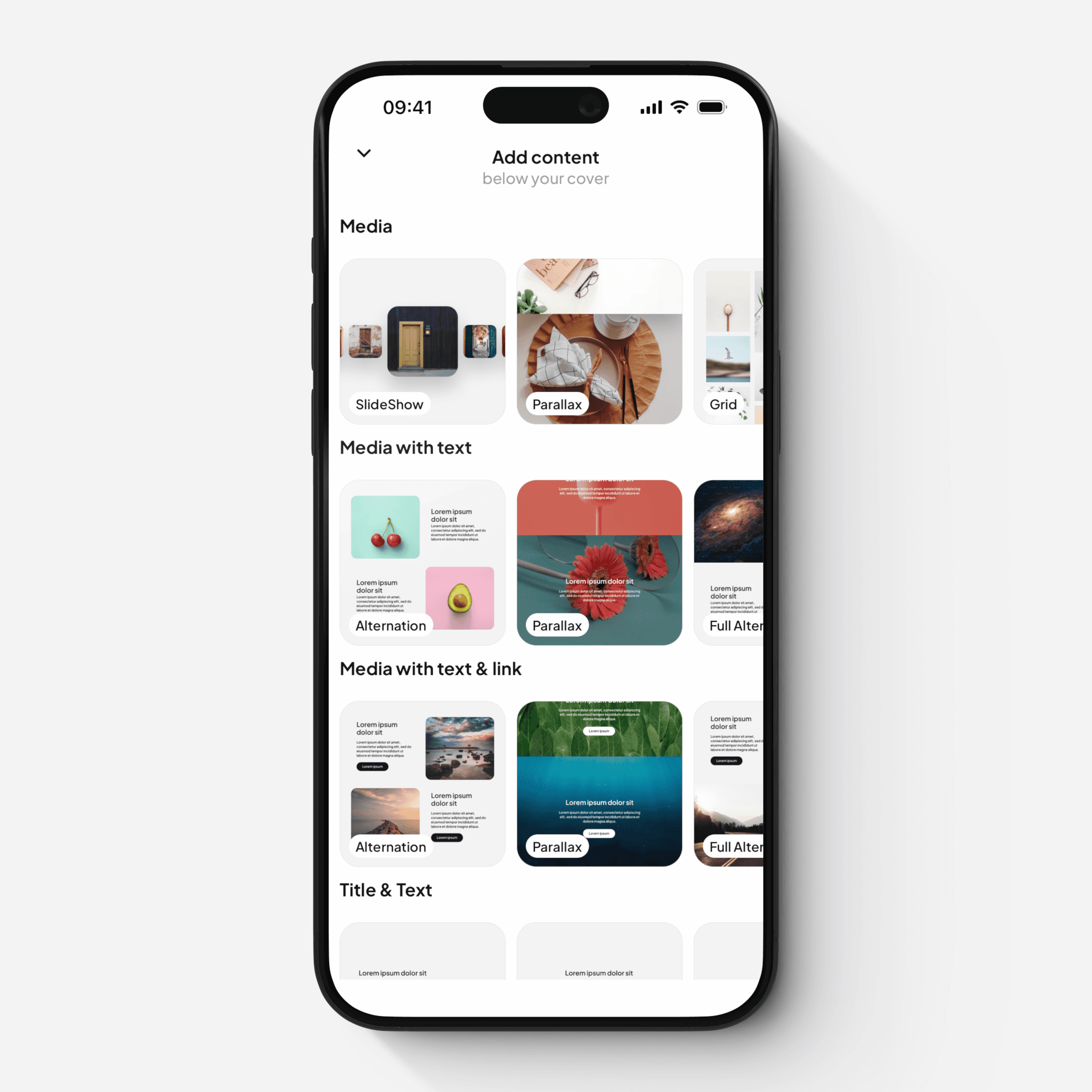
Below the Cover, you can add multiple sections to structure your content.
Sections support rich, responsive content, including:
Media galleries
Media with text
Media with text and links
Rich text blocks
Buttons and links
Separators
Simple Text and Title
Each section type includes multiple layout options, with full control over:
Spacing and margins
Font sizes and styles
Colors and visual appearance
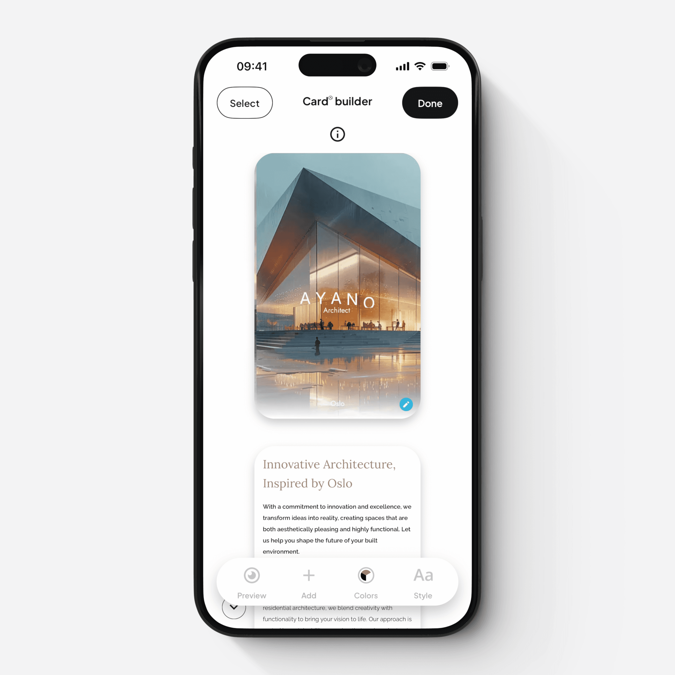
Section Library and Card Builder
You can manage your layout using the Card Builder:
Add new sections from the section library
Reorder, organize, hide, duplicate or delete sections
Review the overall structure of your Card
Styles and Visual Settings
Within the Card Builder, you can apply global design settings:
Color triptychs — define the color combinations used across your Cover and sections
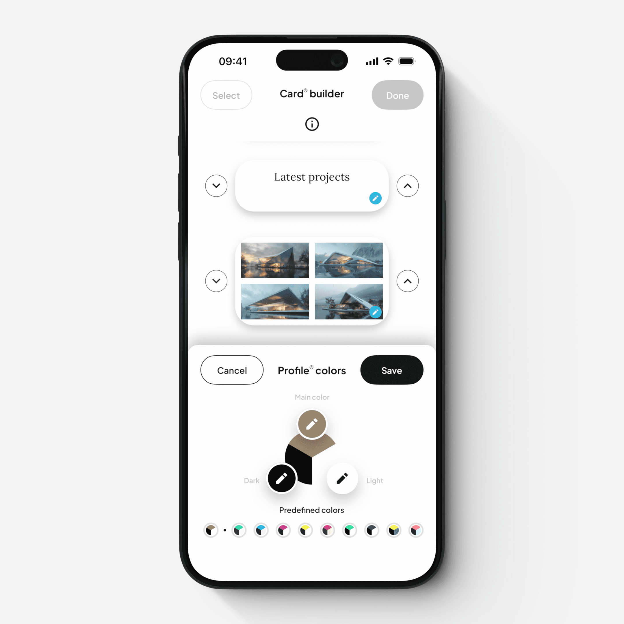
Styles — control global settings such as fonts, spacing, padding, and border radius
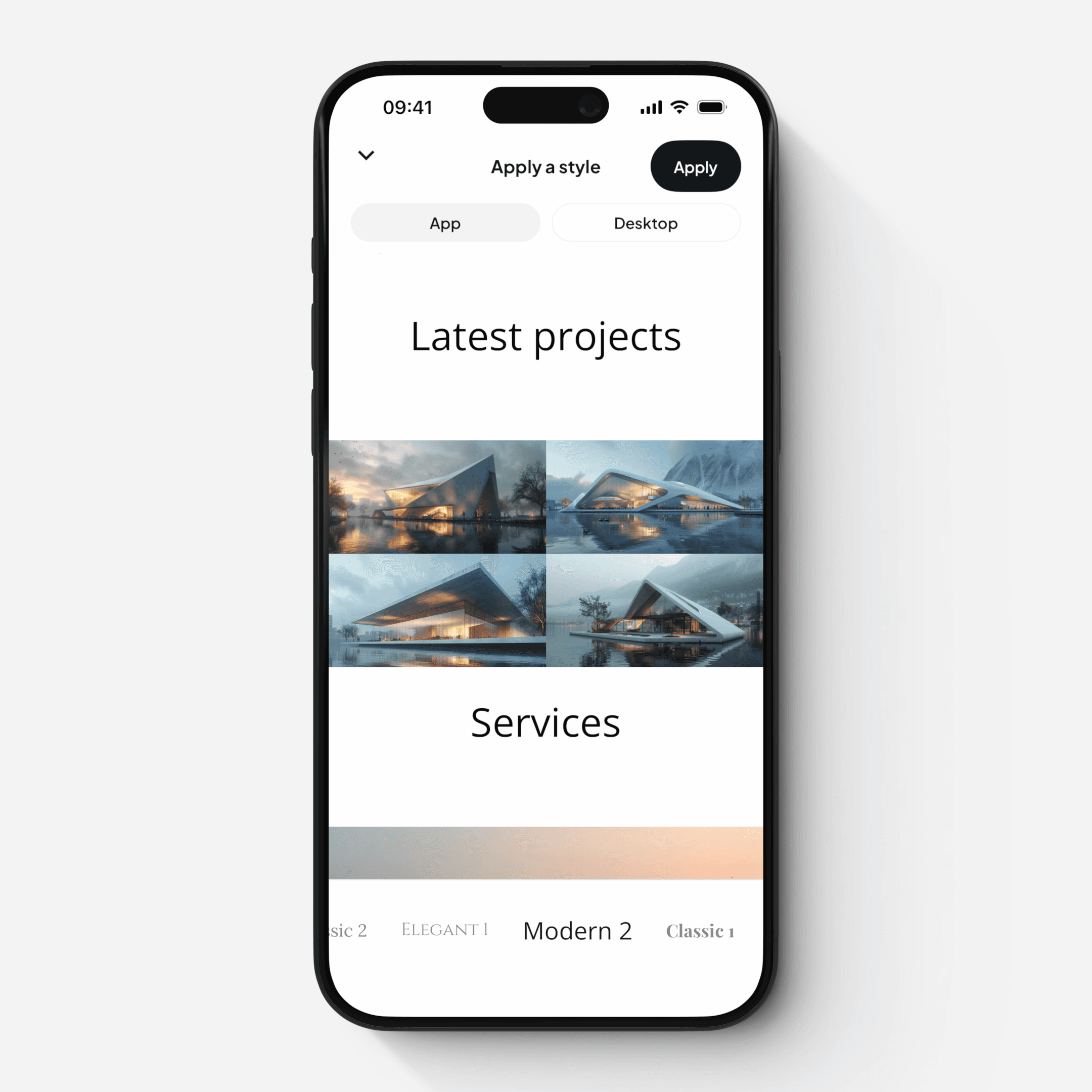
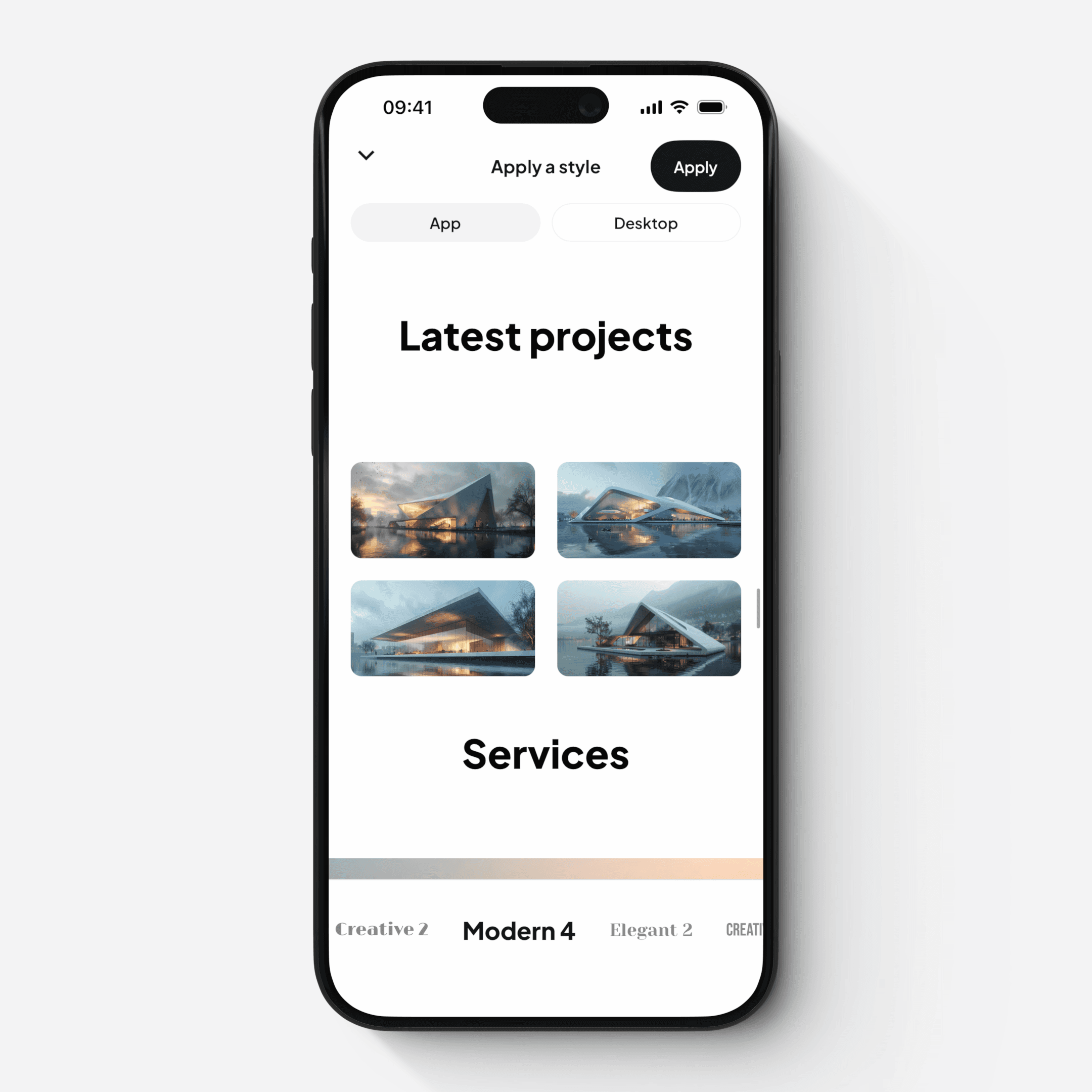
Preview
All changes can be previewed in real time:
Mobile view
Desktop (browser) view
This ensures your Card looks great across all devices.